Image conversion, resizing and compression with WebAssembly
5 minute readImage conversion and resizing for the web can be quite fiddly. Take responsive websites for instance. You want to show a smaller version of your image on smaller devices: You don't need to download a 1080px wide image to show on a 360px wide device, especially since that device is likely constrained in the amount of bandwidth it has. Then again when your website is shown on an ultra HD screen with 3840x2160 resolution 1080 is maybe even too small.
Apart from multiple sizes, you also want to offer multiple formats. Modern browsers support new(er) image formats like webp and avif offer better compression for comparable image quality. Using these formats you can decrease the total download size of your page, while improving the overall experience for the user. But you just can't assume (yet) that all browsers support those newer formats, so you have to provide older formats as a fallback option. All in all the amount of different files you have to offer for just a single image on a web page starts to become quite large and the whole thing becomes, like I said, fiddly.
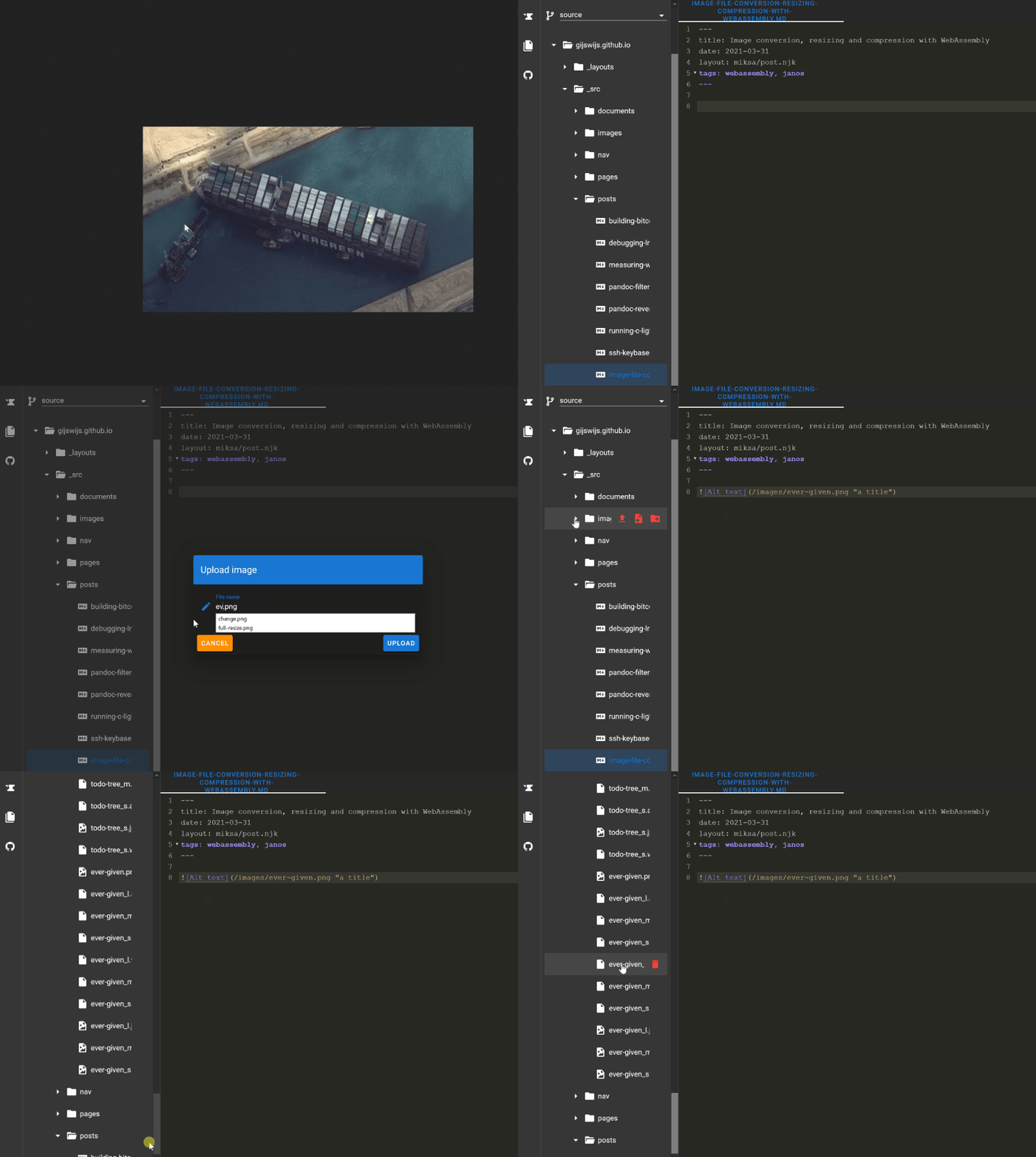
Now look at the gif below.

What is happening here? The gif shows the process of screen clipping an image and then pasting it inside the Janos editor. Upon pasting the image, the image is "uploaded", and that starts a process of resizing and conversion. I use scare quotes around uploaded, because there isn't anything uploaded yet. Janos uses a small git client under the hood that stores the file in memory as a git blob. Only after committing to GitHub files are really uploaded to the GitHub servers. The pasted image is resized to three different sizes and three different formats (avif, webp and jpg), so in total 9 versions of the image are created. The original image is also stored in all its unresized greatness, making the total amount of files a nice 10. If the original image is copy-pasted like in the example above, it is stored as a png file. If the image is "uploaded" as a file it's kept as-is.
This workflow takes the fiddle out of fiddly and leaves us with a nice process of putting images inside a post without hassle. But the attentive reader might ask:
How does this work? -- Attentive reader
Since an actual upload hasn't happened yet, this whole process has to take place inside the browser and it uses WebAssembly to make it happen.
Conversion and resizing with WebAssembly
GoogleChromeLabs has made the Squoosh app, an amazing web app that offers image compression in all the formats you want. It also offers a Squoosh cli for compressing multiple files at once. I forked Squoosh and made a simple (and hacky) version of the Squoosh cli that runs in the browser. It is like a headless version of the Squoosh app, if you will. For each format Squoosh supports, it uses a codec (did you know codec is a portmanteau of coder-decoder?) developed in either Rust or C++ and compiled to WebAssembly. So this enables the browser to do some pretty heavy lifting with regards to resizing and converting our image. If I run it on my laptop I can hear the fans spin up to cope with the demands of the cpu.
From Markdown to html
After pasting the image, the Markdown syntax for inserting an image is pasted in the document with a reference to the original file. But that is obviously not the file we want to show in the resulting HTML. In our HTML we want an picture element that contains all our files in all formats and sizes. It should look like this:
<picture
  ><source
    srcset="
      /images/ever-given_s.avif 461w,
      /images/ever-given_m.avif 692w,
      /images/ever-given_l.avif 922w
    "
    type="image/avif" />
  <source
    srcset="
      /images/ever-given_s.webp 461w,
      /images/ever-given_m.webp 692w,
      /images/ever-given_l.webp 922w
    "
    type="image/webp" />
  <img
    srcset="
      /images/ever-given_s.jpg 461w,
      /images/ever-given_m.jpg 692w,
      /images/ever-given_l.jpg 922w
    "
    src="/images/ever-given_s.jpg"
    alt="Container ship Ever Given"
    title="Container ship Ever Given stuck in the Suez Canal"
    loading="lazy"
    decoding="async"
    width="922"
    height="480"
/></picture>
<figcaption>/images/todo-tree.jpg</figcaption>
The above snippet is derived from this snippet with some minor adjustments. It uses srcSet to offer the different sizes of the image. It uses different srcSet to offer the different formats, and it uses src to offer the smallest version to browsers that don't support any of it. Since width & height are important for rendering pages fast without layout shifts, we add the width and height from the largest version of the image. This did result in some problems that took quite some time to get figured out:
Apparently the use of width and height nullifies any use of the sizes attribute in combination with the srcSet. The sizes attribute is meant for defining a set of media conditions (e.g. screen widths) and indicates what image size would be best to choose. The browser uses that info in combination with other information (like device-pixel-ratio) to determine which image file it will download. But because we want to use width and height this means that the sizes attribute is unavailable to us. So we are forced to use good ol' css to indicate the different image sizes under different media conditions.
.article img {
  max-width: 100%;
  height: auto;
}
figcaption {
  text-align: center;
  margin-top: -1.5rem;
  font-style: italic;
}
@media (min-width: 40rem) {
  .article img {
    max-width: calc(100% - 6rem);
    height: auto;
    margin: 0 3rem;
  }
}
@media (min-width: 80rem) {
  .article img {
    max-width: calc(100% - 12rem);
    height: auto;
    margin: 0 6rem;
  }
}
Metalsmith plugin for the picture element
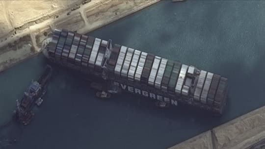
The final ingredient in this mix is a metalsmith plugin that creates the HTML picture element, based on the image referenced in the Markdown. It detects the image, figures out what kind of resized files are available and then converts the Markdown to a picture element. So in the end the picture will look like this:

Releasing everything as separate modules
Currently everything is integrated inside the Janos code base. But I plan on releasing both the headless Squoosh library and the Metalsmith plugin as separate npm modules. When that is done and dusted I will do write-up on how to use and configure said modules to suit your needs.
By the way that static site generator you see in action in that post (gijsvandam.nl/post/image-con…) was entirely built with Vue. I thought you might like that.
I haven't learned Rust myself so I'd also be keen to know